文档流(标准流)
标准流:块级元素纵向有序排列,行内块(行内)元素横向有序排列.
元素自上而下,自左而右,块元素独占一行;行内元素在一行上显示,碰到父集元素的边框换行.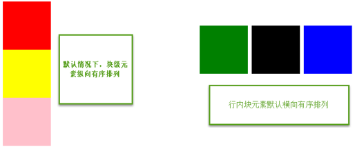
怎么能让div乖乖的横向排列呢?
浮动布局
浮动原理
float: left | right
特点:
★浮动找浮动,不浮动找不浮动
★浮动只影响后面的元素
★浮动以元素顶部为基准对齐
★元素浮动之后不占据原来的位置(脱标)
★浮动的盒子在一行上显示
★行内元素浮动之后转换为行内块元素。(不推荐使用,转行内元素最好使用display: inline-block;)
1 |
|
浮动的作用
浮动的作用: 文本绕图;制作导航;网页布局.
制作导航1
2
3
4
5
6
7
8
9
10
11
12
13
14
15
16
17
18
19
20
21
22
23
24
25
26
27
28
29
30
31
32
33
34
35
36
37
38
39
40
41
42
43
44
45
<html lang="en">
<head>
<meta charset="UTF-8">
<title>Document</title>
<style type="text/css">
body,ul,li{
margin:0;
padding: 0;
}
ul,li{
list-style: none;
}
.nav{
width: 800px;
height: 40px;
background: pink;
margin: 20px auto;
}
.nav ul li{
float: left;
}
.nav ul li a{
display: inline-block;
height: 40px;
font: 14px/40px 微软雅黑;
padding:0 20px;
text-decoration: none;
}
.nav ul li a:hover{
background: #aaa;
}
</style>
</head>
<body>
<div class="nav">
<ul>
<li><a href="#">百度</a></li>
<li><a href="#">百度一下</a></li>
<li><a href="#">谷歌一下</a></li>
</ul>
</div>
</body>
</html>
网页布局1
2
3
4
5
6
7
8
9
10
11
12
13
14
15
16
17
18
19
20
21
22
23
24
25
26
27
28
29
30
31
32
33
34
35
36
37
38
39
40
41
<html lang="en">
<head>
<meta charset="UTF-8">
<title>Document</title>
<style type="text/css">
.header,.main,.footer{
width:900px;
}
.header,.footer{
height: 100px;
background: #000;
}
.main{
height: 300px;
background: #eee;
margin: 10px 0;
}
.content{
width: 300px;
height: 300px;
background: orange;
float: left;
}
.sidebar{
width: 190px;
height: 300px;
background: green;
float: right;
}
</style>
</head>
<body>
<div class="header"></div>
<div class="main">
<div class="content"></div>
<div class="sidebar"></div>
</div>
<div class="footer"></div>
</body>
</html>
清除浮动
当父盒子没有定义高度,嵌套的盒子浮动之后,下边的元素发生位置错误。出现这种情况,我们需要清除浮动。
清除浮动不是不用浮动,而是清除浮动产生的不利影响。
清除浮动的方法:额外标签法; 给父集元素使用overflow:hidden; 伪元素清除浮动
clear: left | right | both
工作里用的最多的是clear:both.
额外标签法
额外标签法:在最后一个浮动元素后添加标签.(一般不用)
在页面中可能会有很多浮动,那就需要加很多div,会很麻烦,且影响性能.1
2
3
4
5
6
7
8
9
10
11
12
13
14
15
16
17
18
19
20
21
22
23
24
25
26
27
28
29
30
31
32
33
34
35
36
37
38
39
40
41
42
43
<html lang="en">
<head>
<meta charset="UTF-8">
<title>Document</title>
<style type="text/css">
.header,.main,.footer{
width:900px;
}
.header,.footer{
height: 100px;
background: #000;
}
.main{
/*height: 300px;*/
background: #eee;
margin: 10px 0;
}
.content{
width: 300px;
height: 300px;
background: orange;
float: left;
}
.sidebar{
width: 190px;
height: 300px;
background: green;
float: right;
}
</style>
</head>
<body>
<div class="header"></div>
<div class="main">
<div class="content"></div>
<div class="sidebar"></div>
<!-- 额外标签法 -->
<div style="clear:both;"></div>
</div>
<div class="footer"></div>
</body>
</html>
给父集元素使用overflow:hidden (不推荐使用)
如果有内容出了盒子,不能使用这个方法1
2
3
4
5
6
7
8
9
10
11
12
13
14
15
16
17
18
19
20
21
22
23
24
25
26
27
28
29
30
31
32
33
34
35
36
37
38
39
40
41
42
43
44
45
46
47
48
49
50
51
52
53
54
<html lang="en">
<head>
<meta charset="UTF-8">
<title>Document</title>
<style type="text/css">
.header,.main,.footer{
width:500px;
}
.header,.footer{
height: 100px;
background: #000;
}
.content{
width: 300px;
height: 300px;
background: orange;
float: left;
margin-top:-100px; /*有内容出了盒子*/
}
.sidebar{
width: 190px;
height: 300px;
background: green;
float: right;
}
.main{
background: #eee;
margin: 10px 0;
overflow: hidden; /*给父集元素使用overflow:hidden*/
}
.clearfix:after{
content: ".";
display: block;
height: 0;
line-height: 0;
visibility: hidden;
clear:both;
}
/*兼容ie浏览器*/
.clearfix{
zoom:1;
}
</style>
</head>
<body>
<div class="header"></div>
<div class="main">
<div class="content"></div>
<div class="sidebar"></div>
</div>
<div class="footer"></div>
</body>
</html>
伪元素清除浮动 推荐使用
1 |
|
overflow
overflow:visible 默认值,内容不会被修剪,会呈现在元素框之外。
overflow:hidden 内容会被修剪,并且其余内容是不可见的。
voerflow:scroll 内容会被修剪,但是浏览器会显示滚动条,以便查看其余内容。
overflow:auto 如果内容被修剪,则浏览器会显示滚动条,以便查看其余内容。1
2
3
4
5
6
7
8
9
10
11
12
13
14
15
16
17
18
19
20
21
22
23
24
25
26
27
28
29
30
31
32
33
34
35
36
37
38
39
40
41
42
43
<html lang="en">
<head>
<meta charset="UTF-8">
<title>Document</title>
<style type="text/css">
.box {
width: 300px;
height: 300px;
background: #c1c1c1;
overflow: auto;
}
.div{
width: 100px;
height: 80px;
background: red;
}
</style>
</head>
<body>
<div class="box">
<<div class='div'> </div>
<p>overflow属性</p>
<p>overflow属性</p>
<p>overflow属性</p>
<p>overflow属性</p>
<p>overflow属性</p>
<p>overflow属性</p>
<p>overflow属性</p>
<p>overflow属性</p>
<p>overflow属性</p>
<p>overflow属性</p>
<p>overflow属性</p>
<p>overflow属性</p>
<p>overflow属性</p>
<p>overflow属性</p>
<p>overflow属性</p>
<p>overflow属性</p>
<p>overflow属性</p>
<p>overflow属性</p>
</div>
</body>
</html>
定位布局
静态定位 –> position:static
默认值,就是文档流。
绝对定位 –> position:absolute
特点:
★元素使用绝对定位之后不占据原来的位置(脱标,与浮动一样)
★元素使用绝对定位,位置是从浏览器出发。
★嵌套的盒子,父盒子没有使用定位,子盒子绝对定位,子盒子位置是从浏览器出发。
★嵌套的盒子,父盒子使用定位,子盒子绝对定位,子盒子位置是从父元素位置出发。
★给行内元素使用绝对定位之后,转换为行内块。(不推荐使用,推荐使用display:inline-block;)
1 | <!-- 元素使用绝对定位,位置是从浏览器出发。 --> |
1 | <!-- 嵌套的盒子,父盒子没有使用定位,子盒子绝对定位,子盒子位置是从浏览器出发 --> |
相对定位 –> position: relative
特点:
★使用相对定位,位置从自身出发。
★还占据原来的位置。
★子绝父相(父元素相对定位,子元素绝对定位)–> 常用
★行内元素使用相对定位不能转行内块
1 |
|
固定定位 –> position:fixed
特点:
★固定定位之后,不占据原来的位置(脱标)
★元素使用固定定位之后,位置从浏览器出发。
★元素使用固定定位之后,会转化为行内块(不推荐,推荐使用display:inline-block;)1
2
3
4
5
6
7
8
9
10
11
12
13
14
15
16
17
18
19
20
21
22
23
24
25
<html lang="en">
<head>
<meta charset="UTF-8">
<title>Document</title>
<style type="text/css">
.box,.box1 {
width: 100px;
height: 100px;
}
.box {
background: red;
position: fixed;
left: 2px;
}
.box1 {
background: green;
}
</style>
</head>
<body>
<div class="box"></div>
<div class="box1"></div>
</body>
</html>